MoveSavvy
Backstage
Here's some things you might not know about MoveSavvy.
Technology
MoveSavvy uses county-level data from various sources along with the following technologies:
- Streamlit (turns Python scripts into web apps)
- scikit-learn (Python machine learning library)
- Plotly (Python graphing library)
MoveSavvy performs clustering based on the user's responses and then applies a ranking algorithm to score each county for the selected features.
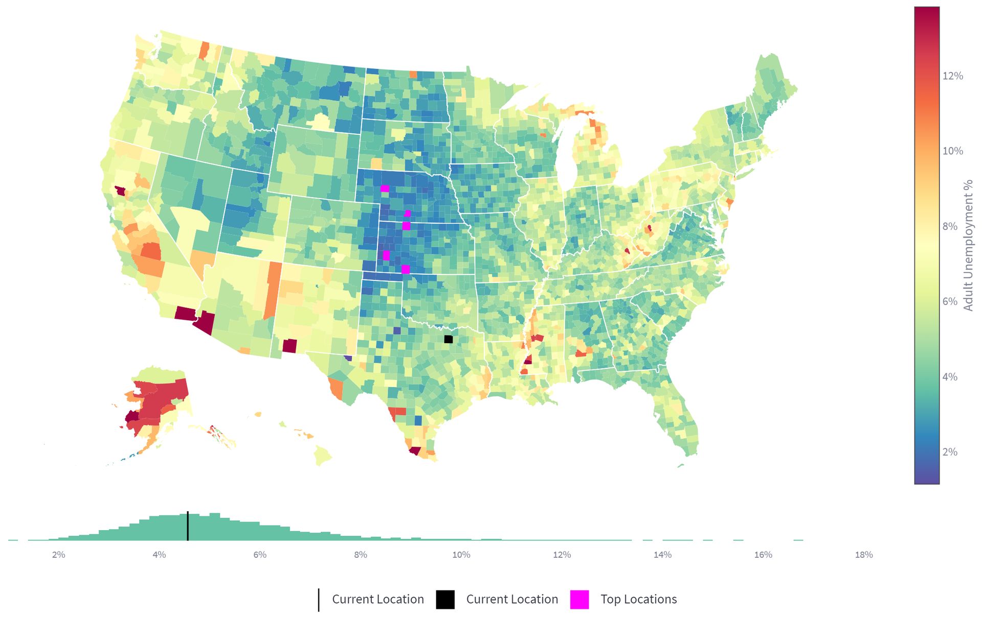
Most commonly available map data, including the Plotly county outline data, does not look good when zoomed in. The outlines can be jagged or county outlines frequently do not match state outlines where they should. To solve these issues, I used map data from the U.S. Atlas TopoJSON repository, which I converted to GeoJSON for use with Plotly. This map data is accurate to 10m and creates state outlines by merging counties together, ensuring consistency.
Background
I created MoveSavvy as part of a team project for Georgia Tech's Data and Visual Analytics course. I created the visualizations and worked with teammates on the machine learning algorithms and front-end interface.
Motivation
Moving to a new location is a potentially life-changing and complex decision which upends all aspects of one's life. A fundamental lack of resources and tools unfortunately exists when determining where to move. Despite the ongoing decline in migration rates over the past few decades, approximately 25 million, or 8% of Americans, still migrate within the United States each year, with many more considering relocation.
With the post-COVID rise of remote work along with other factors such as increased gig-economy employment, job location and residence choice have become decoupled for many Americans. Accordingly, financial affordability along with other features (e.g. weather or political environment) are increasingly driving relocation decisions. Since no such tool exists to serve this ever-increasing gap in demand, my team aggregated several datasets and developed a tool that serves the needs of those considering relocation, as well as government officials seeking to increase migration to their own area.
We developed a visually engaging and interactive tool that allows users to understand how their feature preferences vary across counties. Through selection of features and values, users can receive personalized and data-driven recommendations.
Don't Miss
Here are a few tips or features you shouldn't miss:
- Home Value, Population, and Political Climate allow you to select a target value
- Click the county names under top places to see details for that county
- Click Show Supporting Data at the bottom for maps of each feature